|
SUNDAY EDITION December 22nd, 2024 |
|
Home :: Archives :: Contact |
 |
Oil Market UpdateClive Maund support@clivemaund.com January 4th, 2017 First published on clivemaund.com on 1st January We have some contradictory indications for oil now because its long-term charts look bullish, while it latest COTs and Hedgers charts suggest an imminent reversal to the downside, as do shorter-term charts. Anyone who thinks that this might be an excuse for fence sitting should be aware that we called the exact bottom in oil in November, as the following chart from the last Oil Market update makes plain... 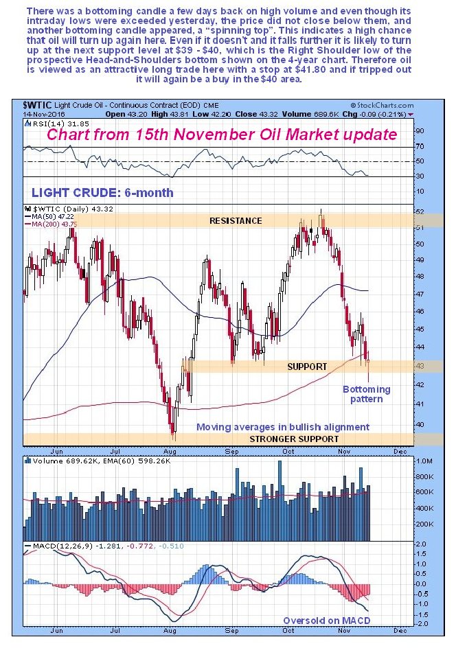 The latest 3-year chart for Light Crude does indeed look positive with oil seemingly break out upside from a large irregular Head-and-Shoulders bottom, with its moving averages in bullish alignment and volume indicators looking reasonably positive. However the breakout thus far is still marginal... 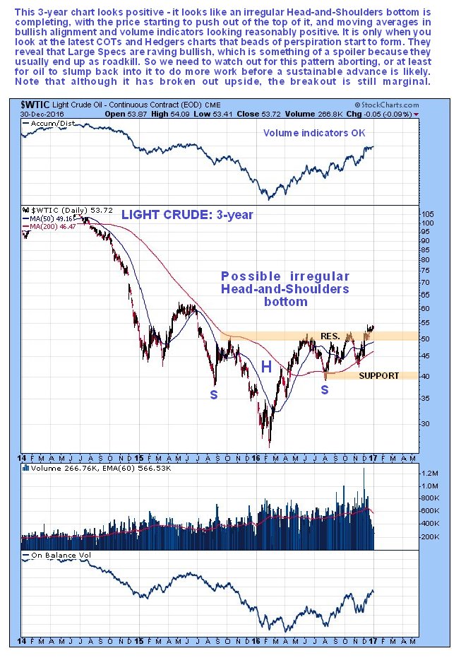 The latest 6-month chart looks a lot less positive, with several factors giving rise to caution. First, the price has hit a target at a trendline originating from the August peak, with a bearish "Shooting Star" appearing at this trendline several weeks back. Next the latest uptrend in force from late November is converging strongly on dwindling volume – it looks like a bearish Rising Wedge, and with the price pushing into the apex of the Wedge and it close to the trendline dating back to August, and the MACD indicator showing an overbought condition and now very close to its moving average, the risk of a sudden break to the downside is rapidly growing. While all this doesn't necessarily mean that the Head-and-Shoulders bottom shown on the 3-year chart will abort, it does at least make it likely that the price will slump back into the pattern first before a sustainable advance can get underway. 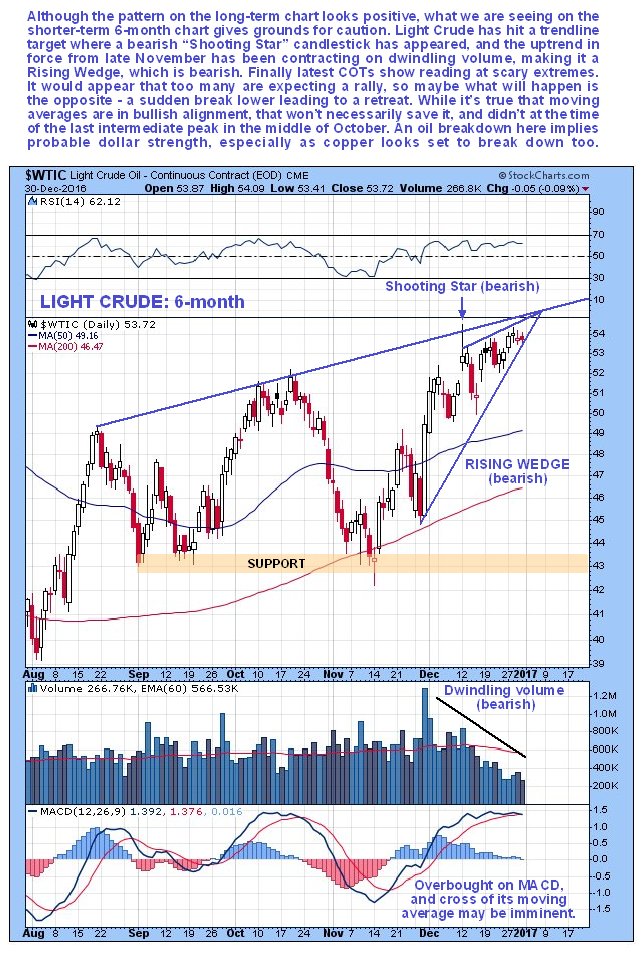 The latest COT chart also sounds a warning, with a comparatively very high level of Commercial short positions and Large Spec long positions. Putting this together with what we have observed on oil's 6-month chart, it does look more likely that oil will break lower soon. 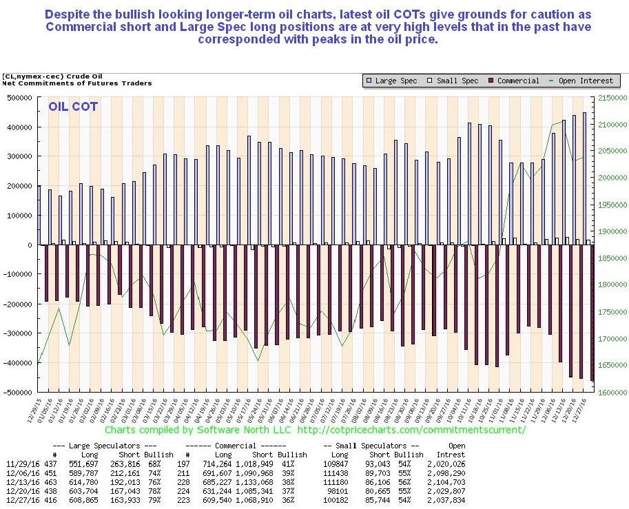 The long-term Crude Oil Hedgers' chart should also be disconcerting for bulls, as it shows positions at levels that in the past have almost always signified important tops. 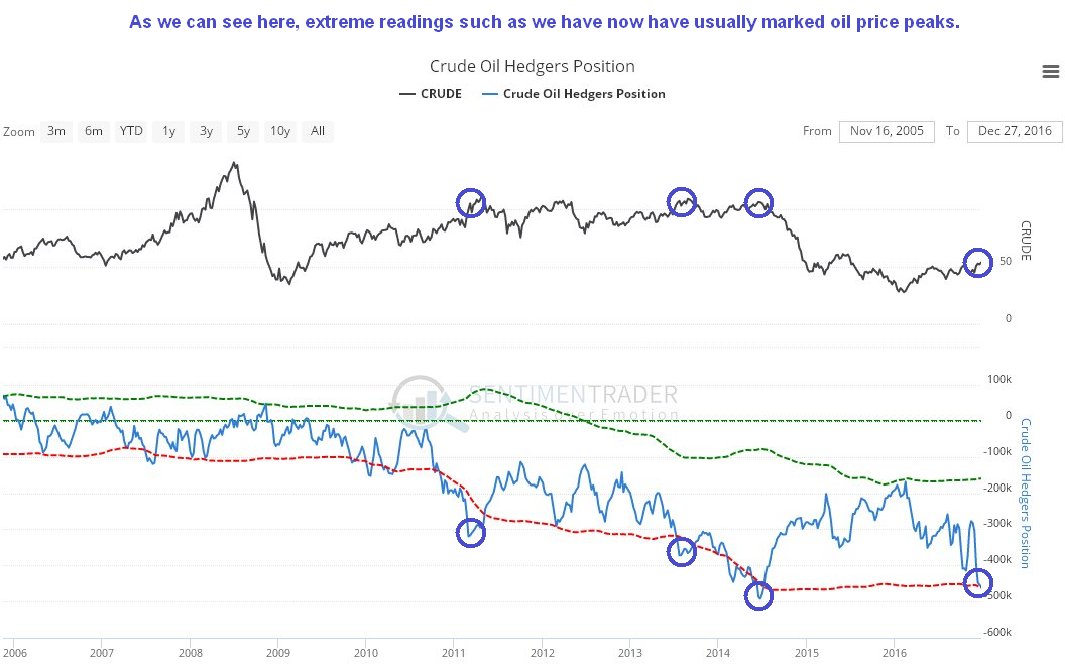 With respect to oil stocks, they broke out upside from their tight trading range as predicted in the last update, as shown on the 3-year chart below for the XOI oil stocks index, and proceeded to advance into the resistance level shown, where, being overbought they have started to react back. 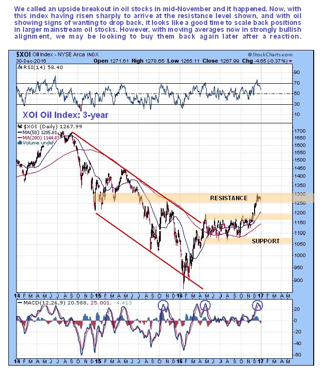 On the 6-month chart for the XOI oil stocks index we can see the significant advance following its breakout from the earlier tight trading range in much more detail, and how having become overbought in a zone of resistance, it has started to react back. Should oil itself now drop back, as its shorter-term charts and COTs are suggesting, then this index could drop all the way back to the support level shown at the top of the earlier trading range, where, depending on how it looks at the time, we will likely turn positive on the sector again. 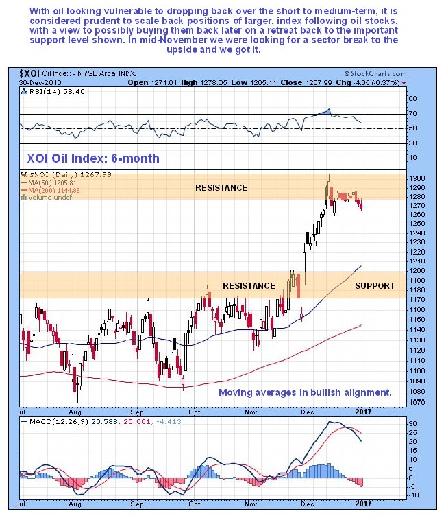 End of update. First published on clivemaund.com on 1st January Clive Maund January 4th, 2017 support@clivemaund.com Clive Maund is an English technical analyst, holding a diploma from the Society of Technical Analysts, Cambridge and lives in The Lake District, Chile. Visit his subscription website at clivemaund.com .[You can subscribe here]. Clivemaund.com is dedicated to serious investors and traders in the precious metals and energy sectors. I offer my no nonsense, premium analysis to subscribers. Our project is 100% subscriber supported. We take no advertising or incentives from the companies we cover. If you are serious about making some real profits, this site is for you! Happy trading. No responsibility can be accepted for losses that may result as a consequence of trading on the basis of this analysis. Copyright © 2003-2017 CliveMaund. All Rights Reserved. |
| Home :: Archives :: Contact |
SUNDAY EDITION December 22nd, 2024 © 2024 321energy.com |
|